
One of the things I like so much about beauty is that it's so multi-faceted. It's not just about straight lotions and potions - cosmetics have back stories and manage to worm their way into all aspects of life and experience. There's nearly always something interesting to ferret out about a product too: is there an interesting sourcing angle, do profits go to charity, is there some whizz-bang new technology involved, or - my favourite - does it have great packaging?
Hands up. I judge books by their cover and I'm not alone: Elizabeth Arden played on our love of pretty looking things with limited edition pot and tube designs for Eight Hour Cream and brands like Benefit, Bliss and Soap and Glory exploit our love of retro-cuteness and quirky, clever slogans and branding.
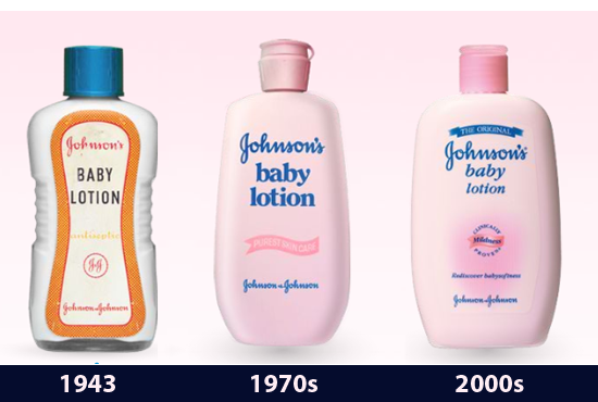
Through the post recently came a promotional bottle of Johnson's Baby Lotion, a product I don't think about from one end of the year to the other. This bottle though, came in a really nice pink box and one look at it confirmed that if it went on shelves as is, you lot would all buy it for the sheer quirk-factor alone. Unfortunately, it was a press sample, but it worked in that it got me thinking about the incarnation of the brand.
Advertised
That made me go back and check out their old bottles. Arguably, the brand image hasn't changed a whole lot since the 70s, but look at the jump they made from the 40s - it looks like a completely different product. And I have to say, I'm loving it. In fact, I'd even buy it.
The campaign to get J&J to retro-ise Johnson's Baby Lotion starts here - who's with me?


