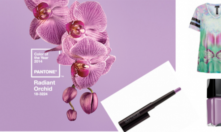
Pantone's Colour for 2014 is Radiant Orchid: How To Wear It Without Looking Like Barney

Pantone have stood upon their colour expert dias and have issued their annual decree for colour of the year.
This time they have chosen Radiant Orchid, a kind of pinky/purple - think Barney when he has the flu, when the poor love is looking a bit peaky and pale.
To be honest, I'm a bit sad to say goodbye last year's colour of emerald. I liked the hue itself and it gave St. Patrick's Day a bit of aesthetic kudos.
The fashion world loves nothing more than embracing a trend so you can expect this shade to pop up both in couture collections and on the high street.
And if you are looking for some inspiration to keep ahead of the colour bandwagon, take a look at our picks to help you get your radiant orchid on.
Advertisement
Makeup is an easy way to wear this trend - play up your nails, lips or eyes and keep the rest of your look neutral.
And look to your wardrobe where you can introduce a bright Pantone colour pop, or just hint at the trend with some beautiful prints.
What do you think of their colour choice? Is the idea of a Pantone colour choice something relevant only to the Vogue fashion editorials of this world or would like to try out the trend in real life? Let us know your thoughts in the comments!