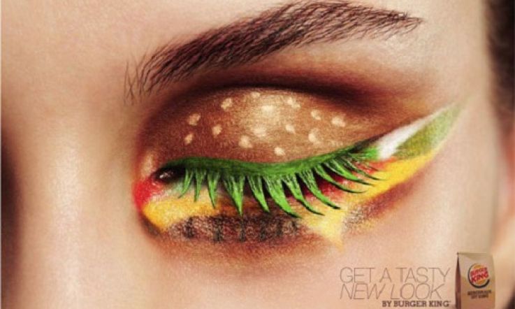
Burger King cheeseburger eyeshadow: yum or yuk?

Brings a whole new meaning to "flashing your burger"* doesn't it?
Nail art is so over darlings. Gimmicky eye shadow is where it's at.
Last month Burger King in the Netherlands brought out a new campaign to advertise their cheeseburger. With eye shadow. Yes that's right. The eyelid represents the seeded bun, the lashes are a spikey sort of lettuce while under the eye pools a gunky cheese and sauce combo. And right down the bottom is the actual burger - complete with char grilled lines.
Advertisement
While I obviously applaud the creativity and skill that this took, to me this does look as horrid and as unappetising as eating a spider.
But it is kind of fun isn't it? What other food could you imagine being replicated upon the eyes?
*In case that's an unfamiliar phrase it's another term for the dreaded camel toe.